Quick Start Screen
3ds Max Asset Library
designer
Clint Lewis
Introduction
In an effort to improve the ramp up time for new users of the 3ds Max Asset Library, I designed a “Quick Start Screen” as requested by the product manager.
Design Iteration
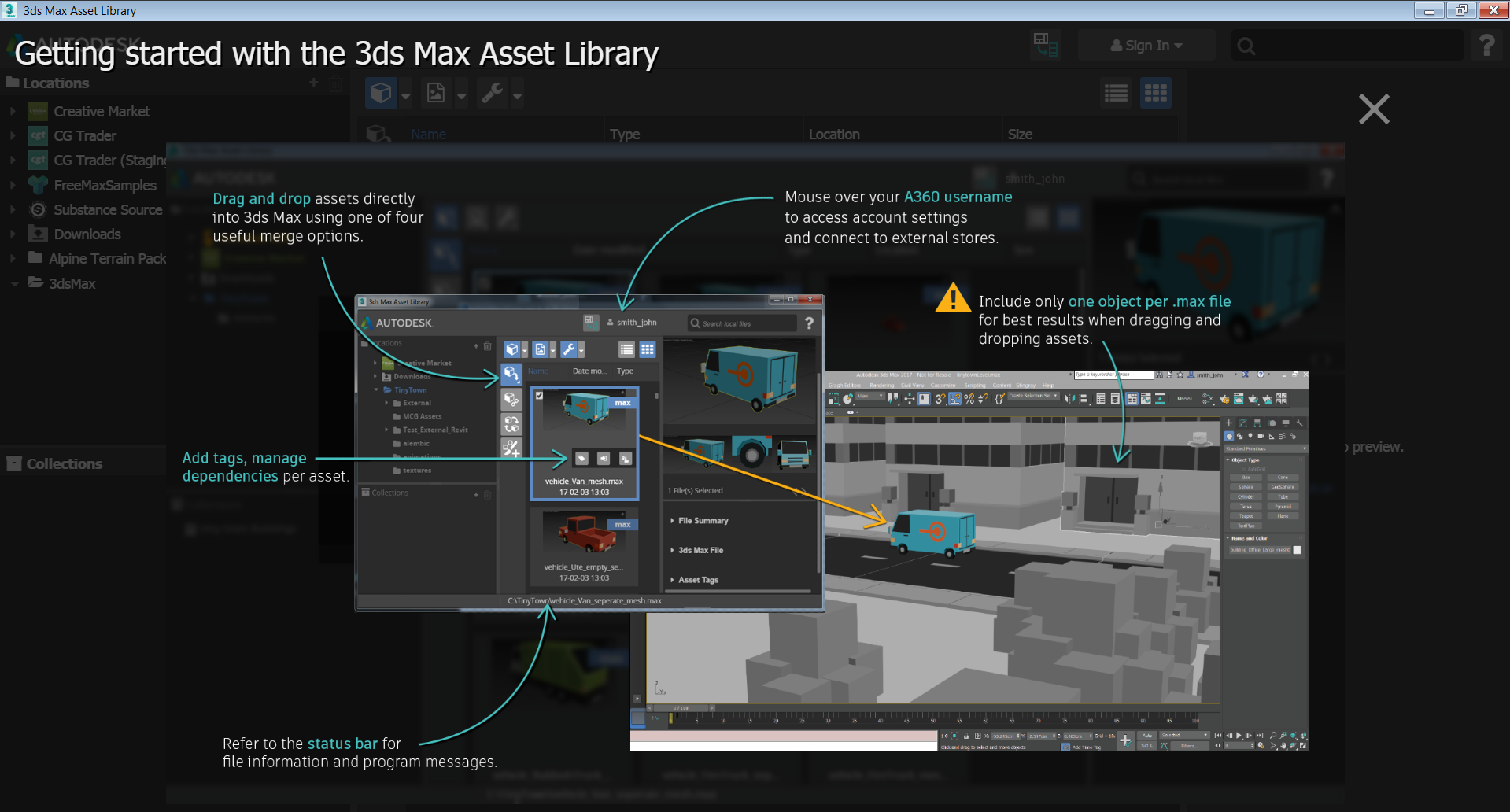
V1
This feature at first glance seems simple. It is basically a static image. But… as a piece of learning content its design needed to be carefully considered.
My first inclination was to provide as much helpful information as possible for the user. The problem was this design quickly became visually “crowded” and difficult to decipher.
In addition I tried to split the information over several screens. That increased the complexity of the work, increasing developer time for a relatively simple feature. That didn’t make sense from an economic point of view.
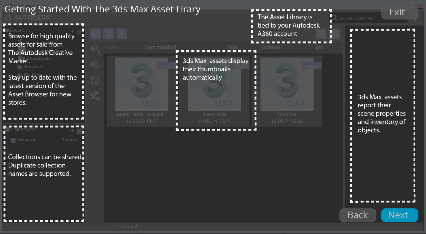
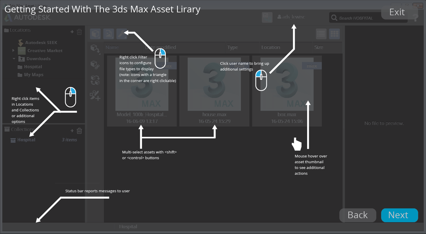
V2
In this second version I reduced the amount of information to key features, and it seems to read much better.
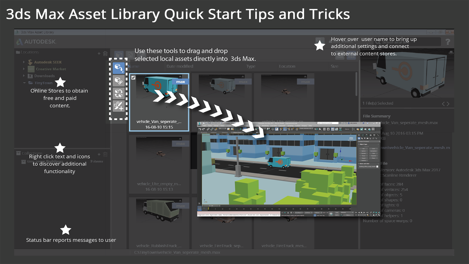
V3
Although I was satisfied with the overall concept, the visuals needed more polish. I worked with our resident graphic designer to refine the concept even further. Below is the final version that is in the product.
Conclusion
The design of learning content, either in the product or outside of it needs special attention. The principals of human computer interaction and great visuals still apply for a effective learning experience.